
My Role
UX & UI Designer
Research, Visual & Interaction Design
Team
3 people - Self Directed
Tools
Figma, Miro, Maze
Delivarable
Desktop & Mobile Web App

Claire is a natural-based cosmetic brand that focuses on sustainability, refillable packaging, and cruelty-free formulas. This project aimed to create a responsive e-commerce platform where customers can customize palettes and virtually try on products before purchase.
About
Project Overview
Goals
1-Product Development:
Design a responsive web experience that supports customizable, eco-friendly makeup palettes.
2- Integrate a Virtual Try-On Feature:
Enable to preview shades in real-time as they build their custom palette.

Claire Cosmetic
Website Design
1 Empathize
Design Concept
12 Questions | 171 Participants

User Interviews
Interview Summary:
-
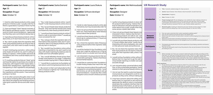
5 Participants were interviewed about their cosmetic routine.
-
4 females, 1 non-binary
-
Age: 18 - 40
-
9 Questions
Results
3/5 users didn’t regularly check expiry dates. Some used expired products knowingly.
4/5 users kept expensive palettes even if they only used 1–2 shades.
All participants preferred building their own palettes over pre-made ones.
3 users explicitly requested a virtual try-on to reduce hesitation when choosing shades online.


Competetive Analysis
None of the rivals provide the ability to completely modify their colour scheme.

Define
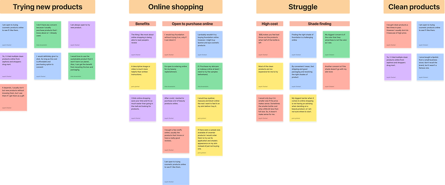
Affinity Diagram
Users want full palette customization. Icons and images aid shade selection, and a try-on feature can ease the top challenge: picking the right shade online.

Persona

Emily Grey | 29
Favorite Brands
Bio
Tired of wasting money on palettes she barely uses, Emily wants an eco-conscious brand that lets her build a personalized palette.
Goals
-
Customize palettes with only her go-to shades
-
Shop clean, cruelty-free products
-
Stay trendy while reducing waste
Challenges
-
Finding affordable sustainable options
-
Often forgets to check expiration dates
User Journey

Storyboard

1- Emily sees an ad for Claire promoting clean, customizable makeup.

2- She visits the website and learns about the brand’s values.

3- Discovering a recycling program, she’s intrigued.

4- She customizes a palette with her preferred shades.

5- At checkout, she’s prompted to create an account.

6-She completes the purchase and receives confirmation.

7- A few days later, she receives her order and tries out the products.

8- Emily shares her positive experience with friends
Develop
Sitemap

Task Flow
Task 1: Purchasing a lip gloss with adding subscription at the checkout.
Loading the website
Navigating to the lip page
Selecting the lip balm & adding it to the cart
Choosing the type of subscription at the checkout.
Completing the checkout process.
Receiving the item.
Task 2: Purchasing a customizable eye shadow palette
Loading the website
Navigating to the Custom palette page
Choosing the product & customize it
Adding the custom palette to the cart
Completing the checkout process.
Receiving the item.
User Flow

Sketches
Designing the Homepage

Version 1
Version 2

Version 3
Final
Designing the Product Page

Version 1
Version 2

Version 3
Final
Designing the Try-On Page
Version 3
Version 2
Version 1

Final
Version 5
Version 4

4 Test
Final Usability Test
Participants were assigned tasks related to browsing and purchasing cosmetic products. You can find the full report HERE.
Methodology
Unmoderated usability test
No. Participants
5 participants
No. Tasks
4 Tasks
Software
Google docs
Google sheets
Sticky Notes
First Feedback Result
Based on the feedback sessions with 5 individuals on our mid-fidelity prototypes, an affinity diagram was created.


-
It was observed that 5 out of 5 users couldn't preview shades while customizing. Needed real-time interaction, not a separate modal or page.
-
It was observed that 3 out of 5 subjects found the hero image slider to be confusing. A static hero image may be the most effective design choice.
-
It was observed that 5 out of 5 subjects said that reviews were buried at the bottom, hard to be found.
Design

Interactive Prototype
Navigate through Claire Cosmetic mobile prototype
Final Design
Homepage

Mobile Experience
Real-time preview when building palettes

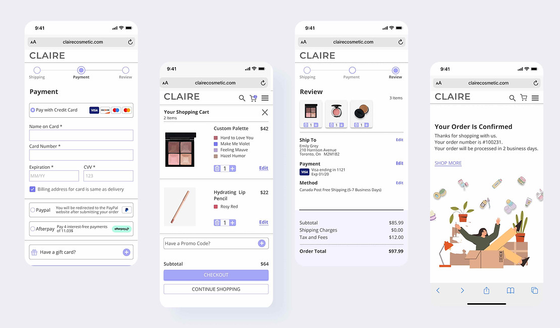
Effortless Checkout
Subscriptions, customization notes, and payment simplified to 3 steps
Style Guide

In Summary
Task
Our team was tasked with designing a cosmetic website for web and mobile devices with the goal of creating an user-friendly experience for customers purchasing products online.
Approach
Utilizing a comprehensive design process, I conducted user research methodology such as interviews, affinity mapping, task analysis, and usability testing to iteratprototyping.
Product
A functional website prototype was developed for both desktop and mobile devices, ensuring a seamless experience across multiple platforms.
