My Role
Product Designer
Team of 2
Timespan
5 Weeks
Tools
Figma
Delivarable
Desktop Web App

We partnered with Pension Bar to design a retirement planning dashboard combining security and flex accounts—aimed at simplifying complex financial decisions for users.The project was developed for presentation to an undisclosed American company.
About
Project Overview

Due to the sensitivity of the data involved, we are unable to disclose the name of the client, and for reference purposes, we refer to it as "Pensionkasse".
Challenges
1. Flow Complexity
Creating a simple flow for users to follow, involving streamlining the user journey to minimize complexity and maximize clarity.
3. Decision-Making Complexity
Providing users with decision-making tools such as scenario comparisons and retirement income customization.
3. Decision-Making Complexity
Providing users with decision-making tools such as scenario comparisons and retirement income customization
Empathize
Design Concept
We were tasked with creating designs based on the design concept provided by Pension Bar, including three primary pages: "Today's Balance," "Retirement Income," and "Conversion."
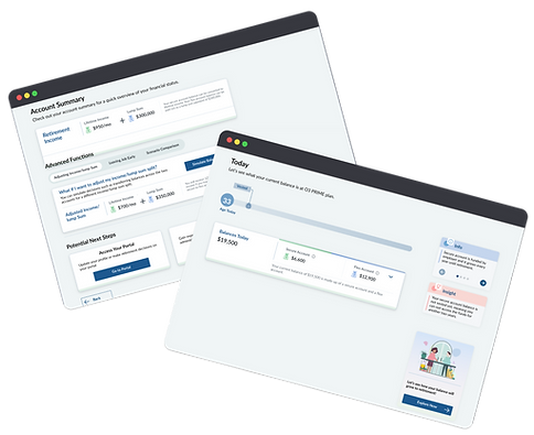
Today's Balance
-
Creates a clear and simple interface to display users' current balances in real-time.
-
Designs the interface with layered information to build a strong foundation for user understanding.


Retirement Income
-
Illustrates the transition from retirement savings to retirement income, in a single page.
-
Employs educational tooltips and information boxes to explain complex financial concepts
Balance Conversion
-
Enables users to adjust retirement income preferences by converting account balances.
-
Prioritizes user control and flexibility with dynamic sliders and input fields.
-
Provides real-time updates on projected retirement income based on user input.

Define
Persona

Sarah Davis | 35
Overview
Emily, a marketing manager, seeks a user-friendly platform to understand pension options.
Goals
-
Understand pension options: Seeking clarity on available plans, contributions, and benefits.
-
Engage with educational content: Prefers interactive materials to learn about pensions.
-
Plan for the future: Aiming for financial stability and considering working longer for additional benefits.
Pain Points
-
Complexity of pension plans: Finds intricacies confusing and overwhelming.
-
Limited engagement with traditional pension materials: Prefers engaging and interactive presentation of information.
User Flow
The initial user flow outlined below underwent substantial revisions throughout the project lifecycle.
.png)
Develop
Wireframe
.png)
UI Elements Iteration
Certain UI elements, such as sliders, milestone flags, and insight boxes, were iterated multiple times
Insight Box

Slider
.png)
Style Guide
Font choices and visual elements adjusted to align with the client's existing branding.
.png)
Test
User Flow
For the design iterations, we focused on refining five main features of the app, ensuring optimal usability and user engagement:
1
Today's Balance
2
Retirement Balance
3
Balance Conversion
4
Leaving Job Early
5
Scenario Comparison
Initial flow
In the initial flow, Today's Balance and Retirement were consolidated onto a single page. This approach proved problematic as the flow became lengthy for users and overwhelming amount of information presented at once..
Today's Balance + Retirement Balance
Balance Conversion
Leaving Job Ealy
Scenario Comparison
Iteration #1
Primary Flow
Today's Balance
Retirement Balance
Balance Conversion
Optional Flow
Leaving Job Ealy
Scenario Comparison
Today's Balance and Retirement were separated, and advanced functions like Leaving Job Early and Scenario Comparison became optional. Although this iteration improved user experience however the client highlighted that the Conversion page was rarely used by early-career users.
Iteration #2
Primary Flow
Retirement Balance
Today's Balance
Optional Flow
Leaving Job Ealy
Scenario Comparison
Balance Conversion
The final flow streamlined the process by prioritizing Today's Balance and Retirement Balance, followed by Account Summary/Next Step. Optional flows were easily accessible. This approach enhanced user flexibility and control over their retirement journey.
Today's Balance
Simplified layout focused on key numbers, with real-time updates and sliders for adjusting retirement age.
Initial Design

Final Design

Retirement Balance
Revised the layout to horizontal, opting to prominently display retirement income on this page instead of leaving job early. We also enhanced clarity by incorporating icons and colors, while adjusting element sizes.
Initial Design

Final Design
.png)
Balance Conversion
The initial slider lacking precision and clarity. Additionally, we introduced consistent icons for improved visual coherence and expanded the accompanying text to enhance user comprehension of the conversion process.
Initial Design

Final Design

Leaving Job Early
Leaving job early has its own dedicated page instead of only a section. Additionally, it now includes a comparison feature, illustrating how much the user will receive at a specific time compared to their retirement income.
Initial Design
.png)
Final Design

Hand-off page
In the final design, users can access comprehensive features like Balance Conversion, Leaving Job, and Scenario Comparison to view updated results. Additionally, they have the option to access their portal for further actions.
Initial Design

Final Design
.png)
Design


Checking Balances
Upon app onboarding, the journey begins with today's balance, followed by retirement savings.

Users can adjust the age slider to instantly visualize retirement savings and income.

Depending on the selected age, users unlock benefits. For instance, retiring after 60 entitles users to medical benefits.
Balance Conversion
Balance conversion is a feature within the advanced function menu, enabling users to customize the lump sum and income they receive at retirement.


Users can view their projected retirement balances for both income and lump sum options.

User can adjust the slider to tilt towards either more security or more flexibility to observe the corresponding changes instantly.
.png)
Leaving Job Early
Based on data, approximately 30% of users opt to leave their jobs earlier than retirement age to access funds.

Upon selecting a departure date using the slider, they can see their balance at the early departure date.

Also, user can see how their balances change if it stays in the plan till retirement.
Scenario Comparison
Users can compare various scenarios, including retirement income, retirement balance, or the balance upon leaving a job.

users can compare scenarios by viewing and analyzing a base scenario along with up to three different ones.

Users have the option to download or save the data within the app's account summary.
In Summary
Task
The task involved designing a retirement planning dashboard for Pension Bar, integrating security and flex accounts to enhance retirement security and flexibility.
Approach
Created wireframes, refining them based on feedback and usability testing. Continuous iteration ensured alignment with project goals
Product
The final product is a user-friendly retirement planning dashboard featuring Today's Balance, Retirement Projection, Account Summary, Conversion Page, Leave Job, and Scenario Comparison.